StellarReads
Project
Senior Thesis
Category
UX/UI Design
Print Design
Exhibition Design
Recognition
*2024 BGSU BFA Senior Thesis Exhibition
*James W. Strong Graphic Design Achievement Award
*Gold ADDY Award
StellarReads was created to address declining student reading engagement by giving students more choice in what they read. As traditional reading lists often feel outdated and disconnected from student interests, research shows that self-selected reading improves both motivation and comprehension. StellarReads is a classroom app that combines reading challenges with a point-based reward system, allowing students to earn incentives like homework passes or gift cards. Each completed book requires a short comprehension quiz to reinforce understanding, track progress, and gain points. By combining choice, motivation, and accountability, StellarReads helps make reading more engaging while supporting meaningful learning.
Project Overview


Process
-
The research behind StellarReads was a year and a half long process that began during the second semester of my junior year in college. That semester was fully dedicated to identifying and deeply researching my chosen topic. I spent that time looking into national literacy data, classroom engagement trends, and studies on student choice in reading. I analyzed reports on declining reading scores, explored current high school curriculum structures, and reviewed research on motivation, gamification, and reward based learning systems. I also looked at existing educational apps to understand what was working and where there were gaps.
All of this research helped shape the foundation of StellarReads, ensuring that the concept was not just creative, but grounded in real data, classroom challenges, and proven educational strategies.
-
Through both primary and secondary research, I found that teen attention spans are shrinking, largely influenced by the fast paced, short form videos they constantly consume on social media. Since this app is designed specifically for high school students, that insight played a big role in how I approached the visual direction. I knew the aesthetic needed to feel fun, engaging, and visually interesting enough to compete with the kind of content students are used to interacting with every day.
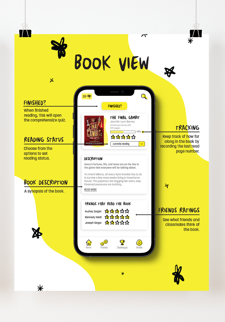
Throughout the design process, I explored several different visual directions before landing on the final look. My early concepts leaned toward bold elements like neon light strips and high contrast visuals to immediately grab attention. Over time, my thinking evolved into something more familiar and intuitive, inspired by the way students take notes on an iPad. That shift led to a design that feels modern and engaging while still being approachable and easy to navigate.
-
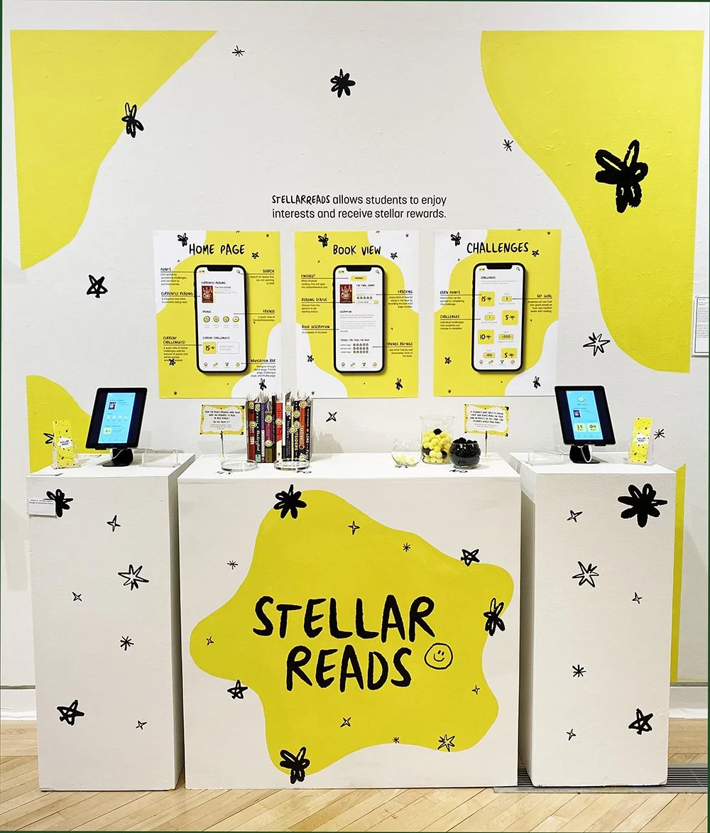
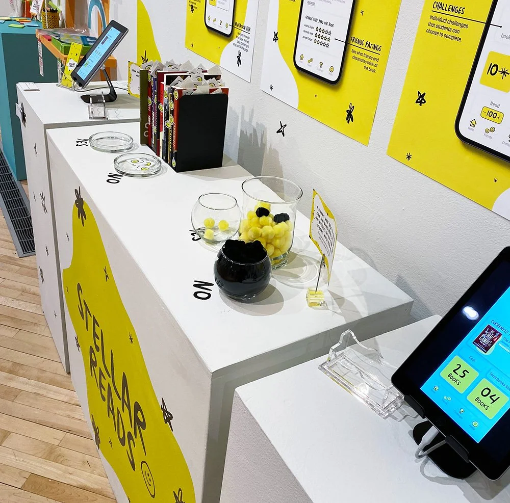
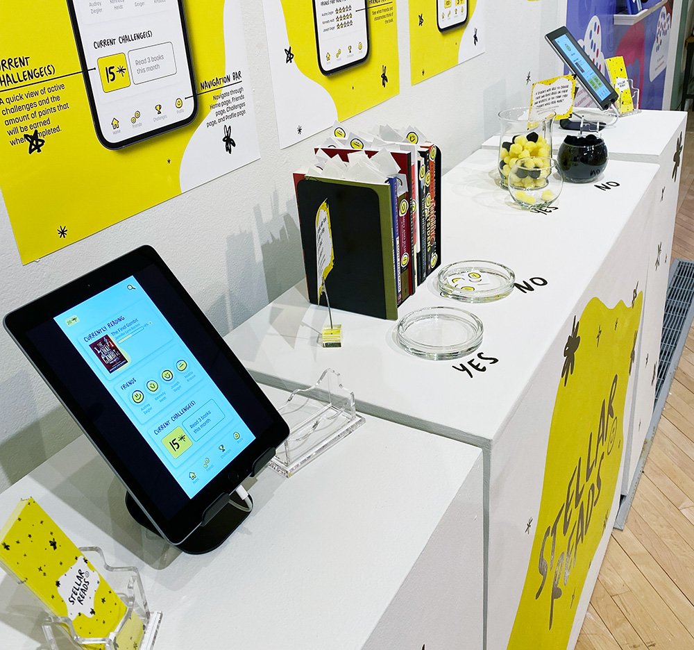
As part of the 2024 BFA Senior Thesis Exhibition Show, StellarReads was displayed as an interactive installation within the gallery space. The setup allowed visitors to explore the app’s features and get a feel for how it works in a classroom setting.
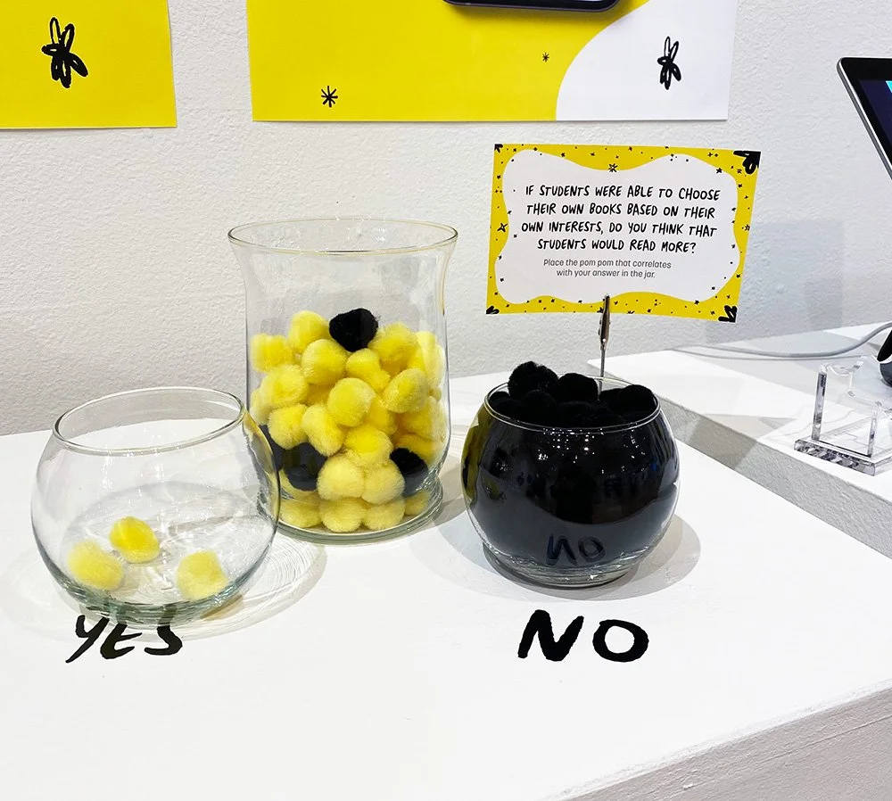
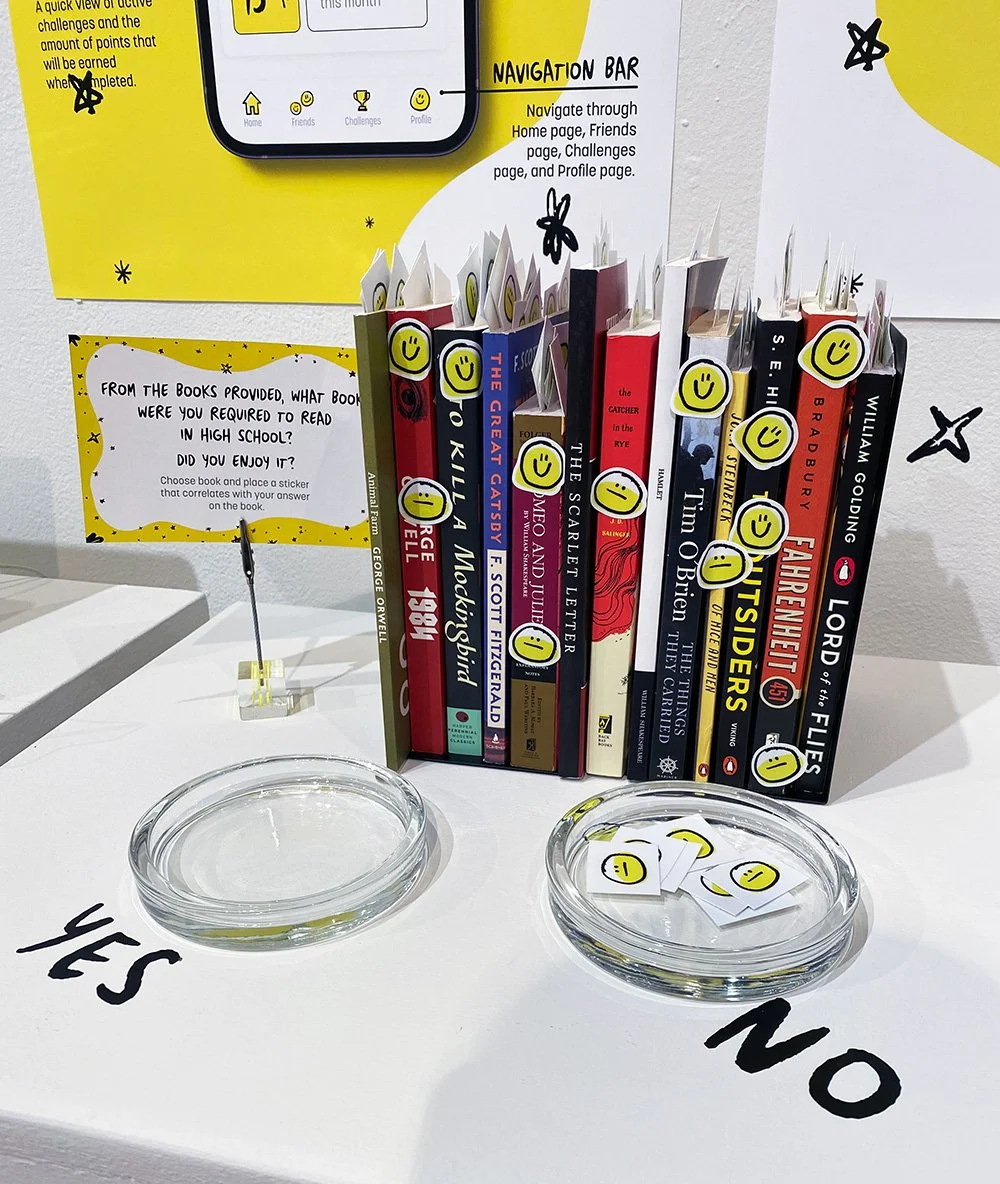
Guests were invited to participate in two interactive activities. In the first, they answered a question by placing a sticker on a book that matched their response. In the second, they responded to a different question by placing a colored pompom into a jar that represented their answer. As more people moved through the gallery, the books and jar quickly began to fill up, visually showing strong support for the idea that students should be able to choose books based on their own interests.
To extend the experience, I also created logo stickers and custom bookmarks for visitors to take with them as a small reminder of the project.